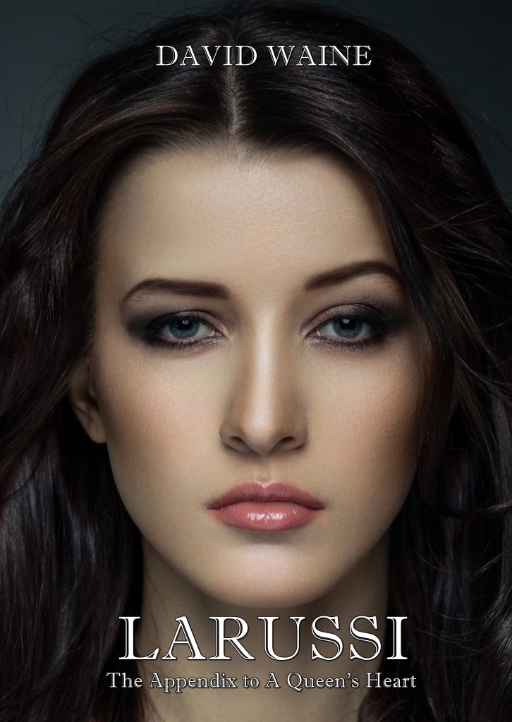
I have been doing a bit of housekeeping on the print editions of my ‘Avalind’ fantasy books. The text remains identical, so there is no need to repurchase if you already have them. What I have done is change the typeface, or ‘font’ as they are usually called these days (inaccurately, but that is by the by). The previous edition was printed in Garamond, an elegant, proportionately-spaced font that has a nice period look to it, in keeping with the setting of the books.
Unfortunately, although I am quite fond of Garamond, it is not very fond of me and refuses to behave. For reasons best known to itself, it decided to italicise headings and remove the italics from headers (the little titles at the top of each page).
Accordingly, I have bitten the bullet and changed the typeface to Palatino, another elegant proportionately-spaced font, much beloved by publishers. Palatino has a slightly sharper look than Garamond and, most importantly for me, it behaves itself so the work emerges looking as it should.
So far, I have converted the four books in the ‘Queen’s Heart’ series. I will convert the older ‘King’s Head’ trilogy very soon.
The new editions should be available from all Amazon stores within the next few days.
Leave a Reply